Cynthia Maller
Three times. During my five years as PayPal's Global Creative Director, I was called upon three times to revise and redesign the brand.
New vision, promise, pillars, voice & tone, new guidelines, the works; More changes than I could ever show on one page. You can see how these brand shifts drove product changes, here.
Should we meet over a cup of coffee (I take a sugar, a sweet n low, and cream. Don't judge.) I can take you through the complete journey. For now, here are some highlights.
It's not easy being blue.


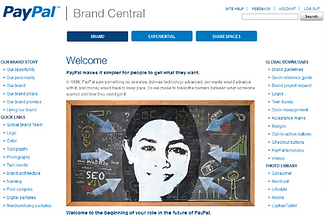
Brand Portal 2009
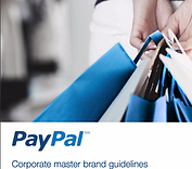
Brand Portal 2012
I believe details matter in building a great brand. When our core attributes changed to include "friendly",
I rounded off the sharp edges in the logo and made the "TM" lowercase.


Employees can't live the brand unless you give them tools to do so. I created a technique, "A Touch of Blue", that showed every market around the world how to turn inexpensive stock photos into brand-aligned assets.